Kurt Christenson ** Timothy Mucci ** Johnny Gatts ** Brian Bannen ** Rick Lacy ** YOU!

Monday, November 29, 2010

KGB Bar - Live Comics Reading

On Sunday Night I dropped by KGB Bar in the East Village to check out the vaguely listed Comix and Graphic Novelists. About the Series: KGB Bar Sunday Night Fiction. The KGB Bar Sunday Night Fiction showcases the finest in contemporary fiction from new and emerging writers.

I knew Emily Wernet had done a turn back around when I reviewed her comic 'Moonlighting', but other than that I hadn't heard of it or where I could get info. Afterwards I stumbled across Tom Hart's blog, the organizer and teacher of cartooning, which provided me with the names of the night's artists and their spots on the web.

Just as an aside, I have one of Tom Hart's 'Hutch Owen' books and I really dug it, one of my first indie cartoonist books I ever bought.

So I stumbled in with my girlfriend Laura Lee (on our third anniversary, and yes, that's months thank you), grabbed a Baltika, a huge Russian beer that is, and we tried not to stand in the way. I had no idea who was going to come out, but I recognized Alex Robinson in the corner, so I knew this would be good.

(I love Box Office Poison and have a sketch inside my copy, hell yeah.)
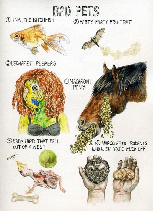


First up came Lisa Hanawalt, who you can meet tonight at Desert Island Comics in Williamsburg as she signs at her launch party for I Want You #2 and her window display at Desert Island.

She warmed up the crowd with her twisted lists from Bad Pets, to Awesome Hats, and How To Tell Martha Stewart's Drunk. Her art style is a wonderfully chaotic balance of fine line illustration and madcap absurdity, bordering on the grotesque at times, though always able to provoke, often into laughter.


Next up was Mike Dawson who was sitting over by Alex Robinson, and I guess that makes sense as they have very similar sensibilities.


He read a selection from his comic Troop 142 which is about as accurate a portrayal of young male life in America as I've seen. It's juvenile and possibly even nonsensical, but absolutely genuine and pure in its delivery of innocence as it lingers for those last few years before being a teenager truly kicks in.

Then there was a brief intermission so we could grab more beers. After we were settled in, then came the closer...Kate Beaton ladies and gentlemen!
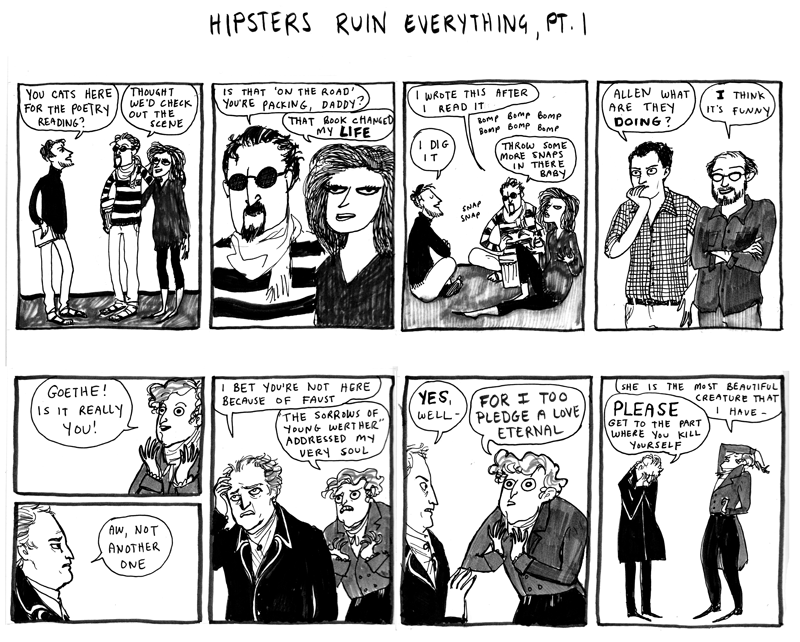

I mean, if there's a cartoonist out there that has more buzz on them besides Kate Beaton, well then point them out dammit! From her Aquaman which has made the rounds on Tumblr, the Gatsby's, the Mystery Solving Teens...I mean, just go to her site and prepare to lose at least an hour as you take it all in. It's consistently funny, in the art style, and delivery of every punchline. You know what's even better than that though? Having Kate herself deliver the lines. Her voice, perfectly gravelly and deadpan as she hits every beat, knowing her strips through and through.

This was definitely a great event that I'd like to see more often than just every three months. Let me see what I can do, maybe wrestle up a venue, certainly know enough artists that'll show their work. Hmmmm...

In the meantime, check out these artists, as all are very top notch indie creators, and come swing by Desert Island tonight and say hello.

K

Twitter

Lisa Hanawalt

Mike Dawson

Kate Beaton

Thursday, November 11, 2010

CASANOVA Review


CASANOVA
by Matt Fraction and Gabriel Ba

What the FUCK did I just read? It's like old Marvel 'Nick Fury, Agent of SHIELD' comics thrown in a blender with Grant Morrison's 'Invisibles' then trying to repaint Michael Moorcock's Jerry Cornelius books. Granted it's all done with Matt Fraction's indelible wit and chock full of chunky ideas and action packed segments.


It's an attractive hardcover, with a 60's-70's vibe plastered all over it, from the trippy color palate and stark design, to the moody Paul Pope/Nick Cave-ish face of Casanova himself. It's quite unlike any other book out there in packaging, if not concept, but it comes with a hefty price tag of $24.99. Is it worth that?


Not really. The gags and action are quite awesome, and the general concept of a time swapped thief turned superspy caught between various warring factions, well that's just all kinds of awesome, tossing in all the things I love. But it really tries to be too clever. The plot is all over the place and I find myself trying to work out what happened and it really is nearly incomprehensible.


And I'm a well trained comic book reader here folks, with twenty years of experience, so I know what I'm talking about. The story has its moments, and the clever ideas are indeed quite clever, and mostly well executed, but the rest inbetween, that little thing we call the plot, it's about as flimsy as it comes.

It reminds me a lot of Fraction's earliest comic, 'Rex Mantooth' from Planet Lar/AIT, which featured a giant talking gorilla supersecretagent in a tuxedo that was illustrated by the lovely Andy Kuhn, and was also chock full of fun (especially the annotated Mantooth which has a running commentary beside each page). But where that was goofy and played it, I feel like Casanova wanted to be taken a bit more seriously, and it falls short.

Granted it does play with the spy tropes and throws in a lot of comic book idioms, but really it's just a big mess of a story with tasty bits. Now, the artwork is quite stunning, and even though the single color shading throughout took some getting used to, it was cool to see something new and when it worked, it worked well. I never was lost to what was happening visually. Just I didn't quite follow the leaps in logic and story structure.


Now, similar critiques could be made about Moorcock's Jerry Cornelius stories, which I love more in theory than practice, but at least he was out there doing it first. Instead this story feels like a cross between a failed pulp novel and an old SHIELD pitch for Marvel with a few hip ideas swiped from today's more polished and esoteric writers.

This isn't a Fraction bash-fest mind you. When the man is on, he's on. His work on Iron Man started rough but rose to brilliant levels, and the previously mentioned 'Rex Mantooth' was thoroughly enjoyable. Maybe I just had high expectations from the concept for the story (sexy superspy sci-fi pulp) and the reviews of it from friends who've read it.

All in all, it wasn't NOT worth reading, and it does set things up in the end (the rather blunt and abrupt ending that wraps up NOTHING) that could potentially make for a really cool second attempt at telling this type of story, but this arc I would consider a failure, and as all spies know, failure will not be tolerated.

I give you all license to kill this book from your reading list.

K

Thursday, November 4, 2010

Warren Ellis' "On What Comics Can Do"

Warren Ellis has long been a champion of the power of the comic format, and has often delved into the--sometimes very technical-- act of creating a story using words and pictures. His GLOBAL FREQUENCY series was somewhat of an exercise in matching specific types of stories with specific artists, and a well done exercise at that. In fact, Ellis goes to great lengths to match all of his projects with artists that he feels maximize the storytelling.

Explaining why comics are important to people who have only a passing knowledge can sometimes be frustrating, but Ellis is in the process of breaking down the distinctions between comics, prose and film. He posted this bit on his site Warrenellis.com.

For the last three months or so, I've been working piecemeal in spare time on a short booklet about writing comics. Here's one small piece of it, the beginning of a section:

In what ways are comics not like film, you ask (in my head)?

Illustration creates a suspension of disbelief.

If Art Spiegelman’s MAUS had been filmed first, it would have had an audience of maybe three people at Sundance. Because the moment everyone trooped on wearing their mouse masks, any larger audience would have lost it and left giggling. Only in the space of cartooning could that conceit work. Not least because we’re already aware, when we come to cartooning, that we’re looking at someone’s processed and hermetic perception of the world. The great success of MAUS is that the mouse faces make us let our guard down, and so we’re hit by the horrible truth of that book from an unprotected angle.

There’s a page I often cite in these conversations, from the 1974 comic MANHUNTER by Archie Goodwin and Walt Simonson. It’s an entire Jason Bourne sequence in a single page. In a Marrakesh alleyway, Damon Nostrand is in a car attempting to run down Paul Kirk and Christine StClair. Kirk pushes StClair to cover, rolls under the speeding car, draws a knife, tears it through the car’s petrol tank as it passes over him, gets clear, lights a match, touches it to the trail of petrol the car leaves, the petrol blazes down the alley to the car, the car explodes, and then they do three or four lines of dialogue while watching Nostrand burn to death about how it’s horrible but really he was a bit of a git and completely deserved it. One page. Employing “camera angles” and compositions that even now the likes of Paul Greengrass would go blind trying to replicate.

Also: a curling, snarling Peter Kuper piece can sear the page with its anger in a way that no photorealistic artist will ever be able to communicate. A room drawn by Eddie Campbell will be more real than any snapshot, because his line is almost like handwriting, and has human breath upon it. Dash Shaw’s work may look rough on first look, but stay with it, look at how he conveys the essence of an idea in every panel, and you’ll realise how hard he sometimes works to evoke an entire world with so few elements.

All of which is to say you’re not necessarily hemmed in by realism, or naturalism of any kind. This is a field that combines, on the one hand, the novel and the poem and the slogan and the news story, and on the other hand every stop from pointillism to cave painting. Understand comics as the marriage of word and picture, as simple as that, and you’ll get a sense of how broad the medium’s reach really is.

I’m currently driving my FREAKANGELS artist Paul Duffield mad by making him draw a sequence partly inspired by the main titles of Gaspar Noe’s ENTER THE VOID. Which is all typography and signwork.

Comics are not film. Film can do some things we can’t. But we have a far larger toolbox.


What do you think? How are comics different than film? How are they different from prose? Let us know in the comments.

Tuesday, November 2, 2010

Write Club! "Piethos!" V. 3, Ep. 6

Write Club can't always be about comics, right? Right! So in this episode Tim & Kurt take the podcast out into the streets of Brooklyn to cover a Slice Magazine reading event.

The event, coordinated by Slice's resident blog czar and online editor, C.A.B Fredricks was your basic head-to-head reading competition featuring the best and the brightest up & comers of the indie publishing world!

photo courtesy of Amy Sly

PIETHOS! A Reading, works like this: Five independent literary organizations were chosen, each selected a champion, and presented a challenge for an opposing organization. Each reader had about one week to compose a story in answer of their challenge. The prize? A FRESH BAKED APPLE PIE!

The event was held at LEGION bar in Williamsburg, Brooklyn.

Listen to the event here:


And now, THE READERS, with visual aids and in order of appearance:

Liz Matthews (Slice Magazine)
photo courtesy of Amy Sly

Liz's story involved some visual aids. To get the whole experience, click on each link as she prompts the picture in her story.


Corey Eastwood (Book Thug Nation)
photo courtesy of Amy Sly

Kate Axelrod (Featherproof Books)
photo courtesy of Amy Sly

Martha Raoli (Canteen Magazine)
photo courtesy of Amy Sly


The Prize:
photo courtesy of Amy Sly

Now Dear Write Clubbers, after listening to the event, who would YOU have chosen to win the nommy pie?
hit counter dreamweaver
web counter html code